 Owen Bradley
 Most living rooms that feel off are not badly furnished. They are badly balanced. A sofa in one undertone, a rug in another, art that fights both, and lighting that shifts every color after dark. Building a living room color scheme is a process with rules you can follow, not a talent you either have or lack. This guide covers the 60-30-10 proportion rule, how to read undertones so your neutrals stop clashing, how to test paint and fabric under your actual lighting, and how to place accent color so a room feels considered rather than decorated at random.
Start With the Piece You Cannot Change
Every scheme needs an anchor, and the anchor should be whatever is hardest or most expensive to swap. In most living rooms that is the sofa, the flooring, or a large rug you already own. Occasionally it is a fireplace surround or a piece of art you refuse to part with.
Choose the anchor first, then pull the rest of the palette from it. A patterned rug is the ideal starting point because a designer has already resolved four or five colors that work together; you can lift two of them for walls and upholstery and one for accents. If your anchor is a plain sofa, the palette is built around its undertone instead.
The mistake here is picking wall paint first. Paint comes in every conceivable shade and can be matched to anything, while sofas and rugs come in limited ranges. Choosing the constrained item first and the flexible item last saves a great deal of frustration.
The 60-30-10 Rule
The most useful proportion guide in interior color is simple: roughly 60 percent dominant color, 30 percent secondary, and 10 percent accent. In a typical living room that maps to walls and large surfaces as the dominant, upholstery and curtains as the secondary, and cushions, art and small objects as the accent.
- 60 percent: walls, ceiling, flooring and the largest rug. Usually the quietest color in the scheme.
- 30 percent: sofa, armchairs, curtains and major cabinetry. Contrasts with the dominant without competing.
- 10 percent: cushions, throws, lamps, art and ceramics. This is where saturated color belongs.
The proportions matter more than the specific colors. Two shades that look uncertain as equal halves of a room often work beautifully at a 60-30 split. If a scheme feels chaotic, the usual cause is too much accent color rather than the wrong accent color, and the fix is subtraction.
Undertones: Why Your Neutrals Clash
Neutrals are never truly neutral. Every grey, beige, white and greige leans warm or cool underneath, and mixing the two leans is what makes an otherwise sensible room look muddy. A grey with a blue undertone next to a grey with a violet undertone reads as a mistake even though both are grey.
To find an undertone, compare a sample against a sheet of pure white paper. Against true white, the bias becomes visible: yellow, red, green, blue or violet. Do this with every major element, including the flooring, which is the undertone most often ignored. Orange-toned oak flooring quietly pushes a whole room warm and fights cool grey upholstery no matter how good each looks alone.
The working rule is to keep all your neutrals on the same side of the warm-cool line, then use the accent color to provide contrast. Warm neutrals with warm neutrals and a cool accent works. Warm and cool neutrals mixed at similar weights usually does not.
Choosing a Color Relationship
Once you have an anchor, decide how the colors relate. Three approaches cover almost every successful living room.
Monochromatic
One hue at several depths, from pale walls to a mid-tone sofa to a deep cushion. It is the safest scheme and reads as calm and expensive, but it depends entirely on texture to avoid flatness. Combine a smooth weave, a nubby wool and a natural fiber rug within the same color family.
Analogous
Neighboring colors on the wheel, such as blue, blue-green and green, or terracotta, rust and ochre. This gives more life than monochrome while staying naturally harmonious, because the colors share pigment. It is the easiest scheme for people who want color without risk.
Complementary
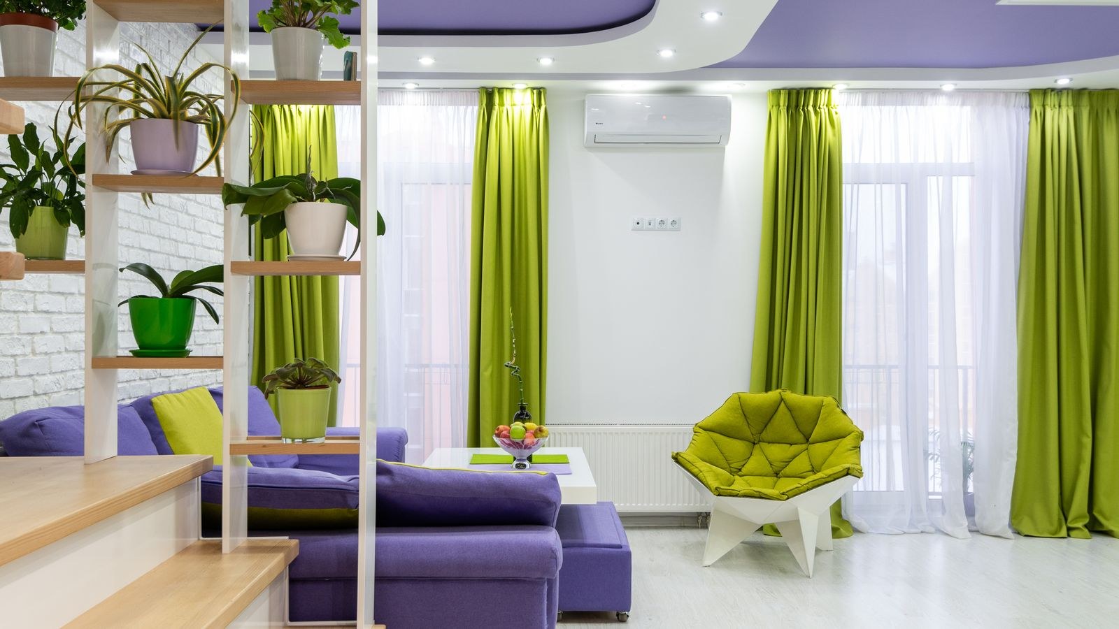
Opposite colors, such as blue and orange or green and rust, used at very unequal weights. Complementary schemes have the most energy and the most potential to go wrong. Keep one color dominant and use its opposite strictly as the 10 percent accent, and desaturate at least one of them so they do not shout at each other.
Working Around Your Sofa
The sofa usually occupies the 30 percent slot and sets the tone for everything else. If you are choosing one now, a mid-tone neutral in a warm or cool family that matches your flooring gives the most future flexibility, since you can change the entire feel of the room with cushions and art later. Broad options across shapes and fabrics appear in our roundup of the best sofas.
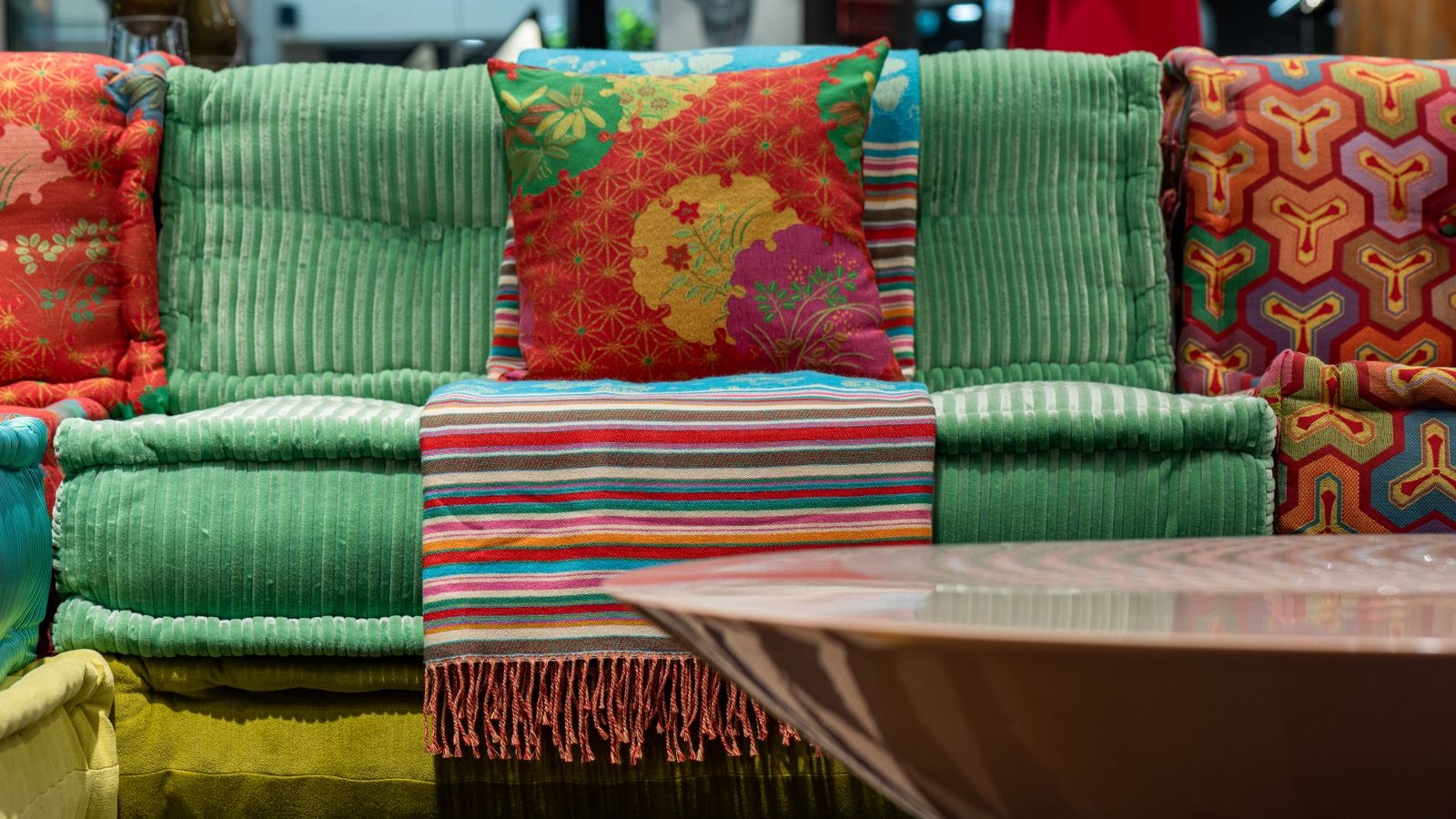
Fabric changes how color behaves as much as the color itself does. Velvet has a directional pile that shifts between light and dark as you move, so a mid green velvet reads deeper in shadow and brighter under a lamp, giving the room depth without adding a second color. It is the most forgiving choice for saturated color; see the best velvet sofas for how different pile depths behave. Linen does the opposite, scattering light softly and muting whatever color it carries, which makes it ideal for warm neutral schemes and relaxed rooms. Our list of the best linen sofas covers weights and weaves. Leather brings its own undertone, almost always warm, and should be treated as a color decision rather than a neutral one.
Lighting Changes Everything
A palette chosen in a showroom under bright cool light can look completely different at home. Two variables control this: the color temperature of your bulbs and the direction of your natural light.
Bulbs around 2700K cast a warm, slightly yellow light that flatters beiges, terracottas and warm woods while dulling cool blues and greys. Bulbs at 4000K and above cast a neutral to cool light that sharpens greys and blues but makes warm neutrals look sallow. Matching bulb temperature to your palette is one of the cheapest corrections available. Equally important is the color rendering index: a bulb with a CRI of 90 or above renders saturated colors accurately, while a low-CRI bulb flattens them regardless of temperature. Our light color temperature guide explains how to pick the right value for a given palette.
Natural light matters just as much. North-facing rooms receive cool, indirect light that intensifies blue and grey undertones, so warm-leaning colors compensate. South-facing rooms get warm light for most of the day and can carry cooler colors comfortably. East and west rooms shift dramatically between morning and evening, which is a strong argument for testing samples at several times of day.
Layering fixtures gives you control that a single ceiling light cannot. A combination of ambient, task and accent lighting lets you change the mood of the same palette from bright and functional to warm and low. Our living room lighting guide covers how to build those layers, and the best lamps for living rooms roundup helps with the table and floor fixtures that carry the warm layer.
Testing Before You Commit
Never choose from a small chip. Paint a large sample board, at least two feet square, and move it around the room over a full day. Look at it against the sofa, near the window and in the darkest corner. Do the same with fabric swatches, and order the largest samples a retailer will send.
View samples vertically for walls and horizontally for flooring, because light hits each plane differently. Check them at night under your actual bulbs, not just in daylight. And view them against white paper rather than against your current wall color, which biases the perception of any sample placed on it.
Common Color Scheme Mistakes
The first is choosing wall paint before the sofa and rug, which reverses the natural order of constraint. The second is mixing warm and cool neutrals at equal weight, which produces the muddy effect most people cannot name but immediately feel. The third is spreading accent color evenly around the room instead of concentrating it, so nothing reads as a focal point. The fourth is forgetting that flooring is a major color decision that never gets counted in the palette. The fifth is ignoring bulb color temperature, then blaming the paint when a carefully chosen scheme looks wrong after dark.
A Quick Palette Checklist
- Anchor chosen? Start from the least changeable item, usually the sofa, rug or flooring.
- Undertones aligned? All neutrals on the same warm or cool side, checked against white paper.
- Proportions set? Roughly 60 percent dominant, 30 percent secondary, 10 percent accent.
- Accent concentrated? Repeated in two or three places, not scattered everywhere.
- Bulbs matched? Warm bulbs for warm palettes, high CRI for saturated colors.
- Tested on site? Large samples, several times of day, under your own lighting.
Frequently Asked Questions
How many colors should a living room have?
Three is the reliable target: a dominant, a secondary and an accent, with neutrals and wood tones counted among them. A fourth color can work if it appears only in art or small objects and shares an undertone with the rest.
Should I pick paint or furniture first?
Furniture first, almost always. Paint can be mixed to match any fabric, but upholstery and rugs come in limited color ranges, so choosing the constrained item first leaves you the most options.
What does undertone actually mean?
It is the subtle color bias underneath a neutral, visible when you compare it to pure white. Two greys can look identical alone and clash badly together because one leans blue and the other leans violet.
Can I use dark colors in a small living room?
Yes. Dark walls can make a small room feel enveloping rather than cramped, provided you keep contrast low and add layered lighting. The result reads intentional as long as the trim and furniture stay in the same undertone family.
How do I add color without repainting?
Concentrate it in the 10 percent layer: cushions, a throw, art, ceramics and lampshades. Repeat the accent in two or three places around the room so it reads as a deliberate thread rather than a stray object.
Final Thoughts
A living room color scheme comes together when you work in the right order. Anchor to the item you cannot easily change, align every neutral to the same warm or cool undertone, split the room roughly 60-30-10 between dominant, secondary and accent, then test large samples under your own bulbs at several times of day. Match your lighting to the palette instead of hoping it will cooperate, and keep saturated color concentrated where it can do the most work. Follow that sequence and the room will look considered rather than assembled, and the palette will still feel right well beyond 2026 as individual pieces come and go.