 Owen Bradley
 If your photos look punchy on screen but come back from the printer muddy and green, or if the same image looks completely different on your laptop than on your desktop, the problem is almost never your eyes. It is an uncalibrated display. Every panel leaves the factory with its own colour bias, and most arrive set far too bright and too blue for anything beyond casual use. Learning how to calibrate monitor colours properly fixes that, and it is one of the cheapest upgrades you can make to a creative workflow. This guide walks through the whole process, from preparing the room to running the built-in Windows and macOS tools, using a hardware colorimeter, and verifying that your screen and your prints finally agree.
What Calibration Actually Does
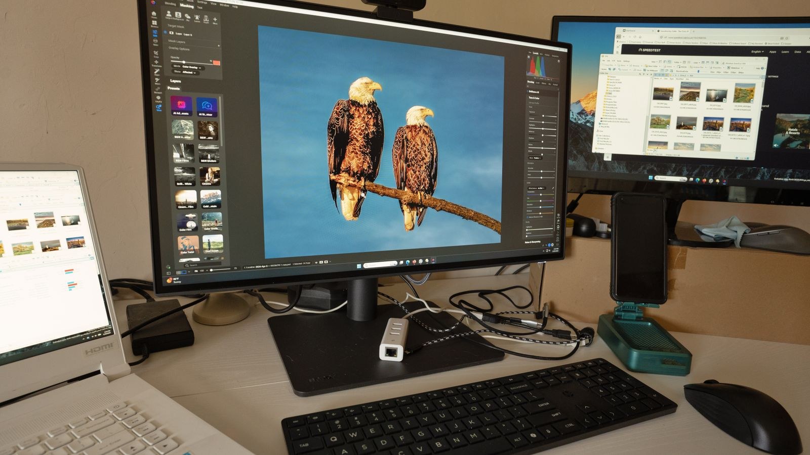
Calibration is two jobs bundled together. The first is calibration in the strict sense: adjusting the monitor’s own controls, brightness, contrast, and the red, green, and blue gain values, so the panel physically outputs a neutral, predictable image. The second is profiling: measuring what the panel actually produces and saving that measurement as an ICC profile so colour-managed software knows how to compensate.
Without the first step, you are asking software to correct a badly misbehaving panel, which throws away tonal range. Without the second, applications have no idea what your display is doing. A good calibration does both, in that order, and the result is a screen you can trust when you judge exposure, white balance, and saturation.
Before You Start: Prepare the Room and the Panel
Calibration measures light, so the environment matters as much as the settings.
- Warm the monitor up. Give the panel at least 30 minutes powered on before measuring. Backlight output and colour temperature drift while a display is cold.
- Control the ambient light. Close blinds, avoid direct sun on the screen, and work under consistent lighting. Bright daylight one hour and a warm lamp the next will make your calibration feel wrong even when it is correct.
- Kill reflections. Avoid a light source directly behind you. A dark, neutral wall behind the monitor is ideal; a bright white or strongly coloured wall will bias your judgement.
- Reset the monitor. Use the on-screen display menu to restore factory defaults, then switch the picture mode to Standard, sRGB, or Custom/User. Turn off dynamic contrast, motion smoothing, blue light filters, and any “vivid” or “eco” preset. These features change output on the fly and make consistent measurement impossible.
- Disable OS night modes. Turn off Night Light in Windows or Night Shift on macOS while calibrating and whenever you do colour-critical work.
Also make sure your panel is worth calibrating. Any decent display benefits, but wide-gamut IPS screens hold accuracy best. If you are still shopping, our roundups of the best monitors for photo editing and the best IPS monitors highlight panels with strong factory accuracy and reliable uniformity, which makes calibration far easier.
Choose Your Targets First
Calibration software asks for three numbers. Decide them before you start rather than accepting whatever is preselected.
- White point: D65, also written 6500K, is the standard for web, video, and general work. Print-focused studios sometimes use D50 to match a viewing booth, but only if you have that controlled lighting.
- Gamma: 2.2 is the correct choice for Windows and modern macOS, and for sRGB work generally. Use 2.4 only for a dedicated dark-room video grading setup.
- Luminance: Around 120 cd/m² for a normally lit room. Drop toward 100 in a dim room, rise toward 140 to 160 in a bright office. Most monitors ship near 300 cd/m², which is why uncalibrated screens produce prints that look far too dark.
How to Calibrate Monitor Colors With Built-In Tools
If you do not own a colorimeter, the operating system tools will still get you closer than factory defaults. They rely on your eyes, so they cannot measure absolute values, but they correct obvious gamma and colour cast errors.
- Open the Windows tool. Press the Start key, type Calibrate display color, and open the Display Colour Calibration wizard. On macOS, go to System Settings, Displays, Colour Profile, and choose Calibrate to open the Display Calibrator Assistant.
- Set gamma. Move the slider until the small dots in the centre of each patch become as invisible as possible against their background. Lean back slightly and squint; this makes the correct setting easier to spot.
- Set brightness. Adjust your monitor’s own brightness control, not a software slider, until the black shirt in the sample image is distinct from the black suit while the X in the background is only just visible.
- Set contrast. Raise contrast until the folds and buttons on the white shirt begin to disappear, then back off until detail returns. Most panels sit correctly between 70 and 80.
- Balance colour. Adjust the red, green, and blue sliders until the grey bars are genuinely neutral with no visible tint. If your monitor offers RGB gain controls in its own menu, use those instead for a better result.
- Compare and save. Use the previous and current calibration buttons to confirm the change is an improvement, then save the profile with a clear name such as Desk Monitor D65.
- Check the text tuner. Let the wizard run ClearType afterwards so text sharpness matches the new settings.
Calibrating With a Hardware Colorimeter
A colorimeter is a small puck that hangs over the screen and measures emitted light directly. It removes guesswork entirely, and for anyone who prints, edits video, or delivers client work it pays for itself quickly.
- Install the vendor software and plug the device into a USB port on the computer itself rather than an unpowered hub.
- Enter your targets: D65 white point, 2.2 gamma, and your chosen luminance. Choose the advanced or expert workflow so the software prompts you to adjust the physical monitor controls.
- Hang the sensor flat against the centre of the screen. Tilt the panel back a few degrees so the counterweight holds the puck snugly with no light leaking between sensor and glass.
- Follow the brightness prompts. The software will display a white patch and read it live while you change the monitor’s brightness control until you hit the target luminance.
- Adjust RGB gain when prompted, using the monitor’s own custom colour menu, until all three channels sit on target. This is the step that removes colour casts at the hardware level.
- Let the measurement run. The software cycles through dozens or hundreds of colour patches. Do not touch the mouse, and keep the room lighting unchanged, which takes five to fifteen minutes.
- Save and set the profile as the system default. Review the before and after comparison and the reported average and maximum delta E values.
Interpreting the results is simple: an average delta E under 2 is good, and under 1 is excellent, meaning errors are essentially invisible. If your numbers stay high, the panel itself may be limiting you. Displays built for colour work, such as those in our guides to the best monitors for graphic design and the best monitors for content creation, typically include hardware calibration support that writes corrections into the monitor’s own lookup table for far better results.
Matching Multiple Screens and Making Prints Agree
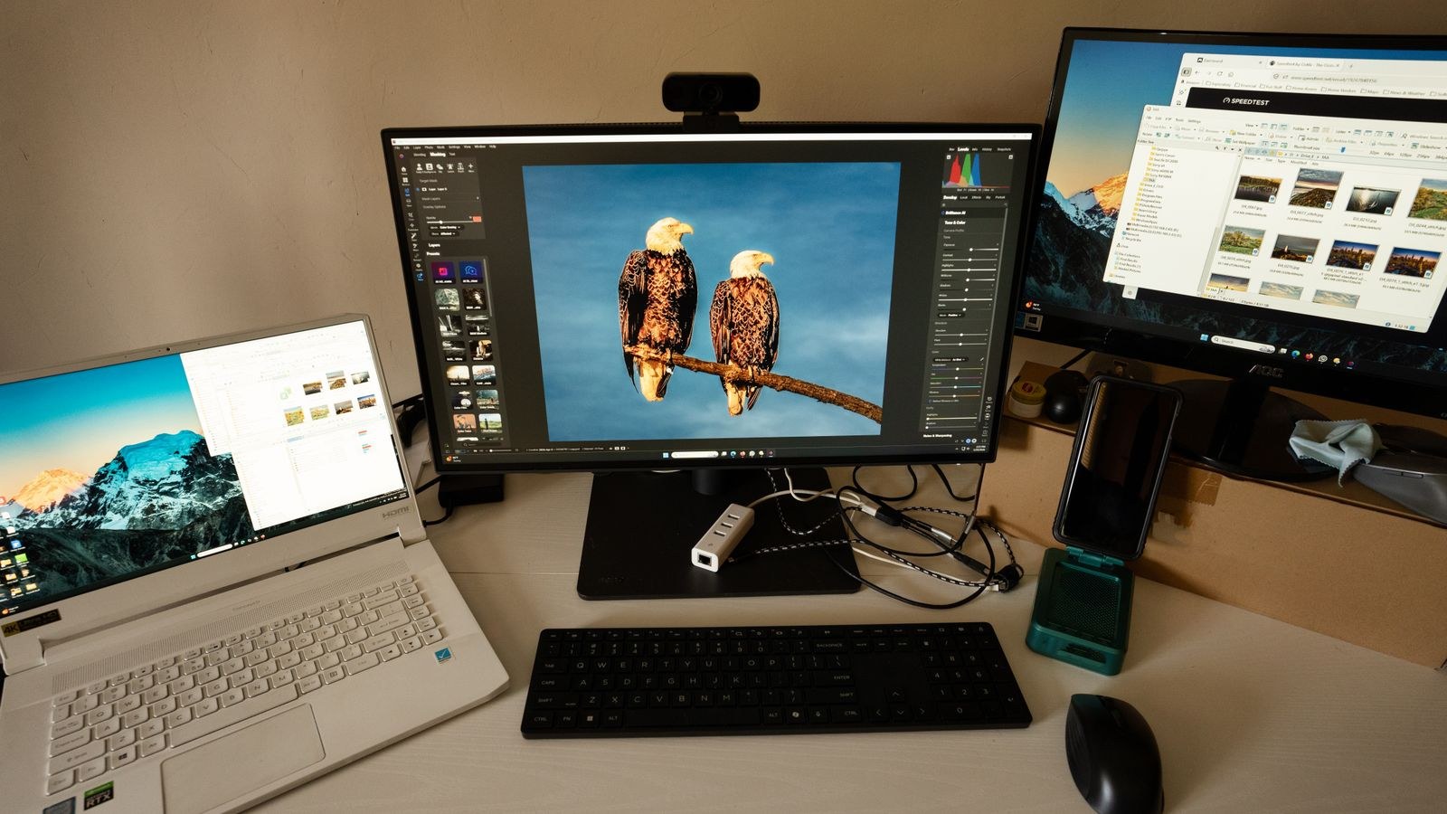
Two monitors will never match perfectly unless they are the same model, but you can get remarkably close. Calibrate both to the same white point, gamma, and luminance targets, and accept the lower brightness ceiling of the weaker panel. Mismatched panel technologies, such as an IPS screen beside a TN one, will always differ at the edges of the gamut and at wide viewing angles.
For prints, calibration is only half the answer. You also need to soft proof: in your editing software, load the ICC profile supplied by your printer or lab for that specific paper, enable soft proofing, and preview the image with the paper simulation turned on. Then let one application manage colour, either the printer driver or the editor, never both. Finally, judge prints under consistent daylight-balanced light. A print viewed under a warm household bulb will always look wrong regardless of how well you calibrated.
High resolution panels deserve the same treatment, since fine detail exposes tonal banding more readily. If you are pairing calibration with a resolution upgrade, our list of the best 4K monitors covers panels that hold their accuracy across the full screen.
Common Calibration Mistakes
- Leaving brightness at factory levels. This is the single biggest cause of prints that come out too dark. Trust the luminance target, not your first impression.
- Leaving a vivid or gaming picture mode active. Any preset that boosts saturation or applies dynamic contrast will undo the calibration the moment content changes.
- Calibrating once and forgetting. Backlights age. Recalibrate every four to six weeks for professional work, or at minimum every few months.
- Running two profile loaders at once. Vendor utilities plus the OS colour management can fight each other. Keep one active.
- Judging colour in non-managed software. Many applications ignore ICC profiles entirely, so images will look different there no matter what you do.
- Ignoring panel uniformity. Calibration measures the centre of the screen. If the corners are visibly dimmer or warmer, keep critical work near the middle.
Troubleshooting a Calibration That Looks Wrong
If everything suddenly looks washed out or tinted after calibrating, check that the profile is actually loading. In Windows, open Colour Management, select your display, tick Use my settings for this device, and confirm your profile is set as default. Then check the Advanced tab and make sure the system is set to calibrate the display using the Windows display calibration.
Windows sometimes drops profiles after a driver update, so reapply the profile or use the vendor’s startup loader. If colours look correct in your editor but oversaturated elsewhere, that application is simply not colour managed.
Frequently Asked Questions
How often should I recalibrate?
Every month for paid colour-critical work, and every three to six months for hobby use. Recalibrate immediately after changing the graphics card, the cable, or the monitor’s firmware.
Can I calibrate without buying any hardware?
Yes, and the built-in wizards are a genuine improvement over factory defaults. But eye-based calibration cannot set absolute luminance or white point, so it will not reliably solve print matching.
Does calibration hurt gaming or video performance?
No. The profile only changes colour output, not frame rate or latency. Many people keep one profile for work and simply switch the monitor to a brighter preset for entertainment.
Should I use my monitor’s sRGB mode?
On a wide-gamut panel, yes, if your work targets the web and you lack a colorimeter. sRGB mode clamps the oversaturated colours that otherwise make everything look artificially vivid.
Final Thoughts
Colour accuracy is a discipline more than a one-time task. Set your room up so lighting stays consistent, choose sensible targets of D65, gamma 2.2, and roughly 120 cd/m², then either run the built-in wizard carefully or invest in a colorimeter for measured, repeatable results. Recalibrate on a schedule, soft proof before you print, and keep one screen as your reference rather than trusting whichever display happens to be in front of you. Do that, and the image you edit will finally be the image everyone else sees.