 Owen Bradley
 Picking a wall color to go with a sofa sounds like a matching exercise, and that is exactly why so many people end up repainting. Holding a two-inch paint chip against the arm of a couch tells you almost nothing, because the thing that decides whether a room works is not the surface color but the undertone underneath it. A gray sofa can lean blue, green, or purple. A beige one can lean pink or yellow. Get the undertone relationship right and almost any color family will sit comfortably; get it wrong and a technically neutral wall will look dirty or clashing next to the upholstery. This guide walks through reading undertones, choosing a relationship rather than a match, and testing properly before you buy five gallons.

Start With the Sofa’s Undertone, Not Its Color
Every color has a bias toward another color sitting underneath it. That bias is the undertone, and it is what your eye reacts to when something feels subtly off. The fastest way to find it is by comparison: place a sheet of pure white printer paper directly against the upholstery in daylight. Against true white, a warm gray will suddenly read brown or taupe, a cool gray will read blue, and a beige will show its pink or yellow lean clearly.
Do this in a few spots and in different light. Then compare the sofa against two or three other fabrics you already own — a white pillowcase, a cream throw, a charcoal blanket. What you are looking for is a consistent verdict: warm or cool, and which direction within that. Once you can name it — “cool gray with a blue-green lean,” “warm beige with a yellow lean” — you have the piece of information that makes every subsequent decision easy.
Why Texture Changes the Reading
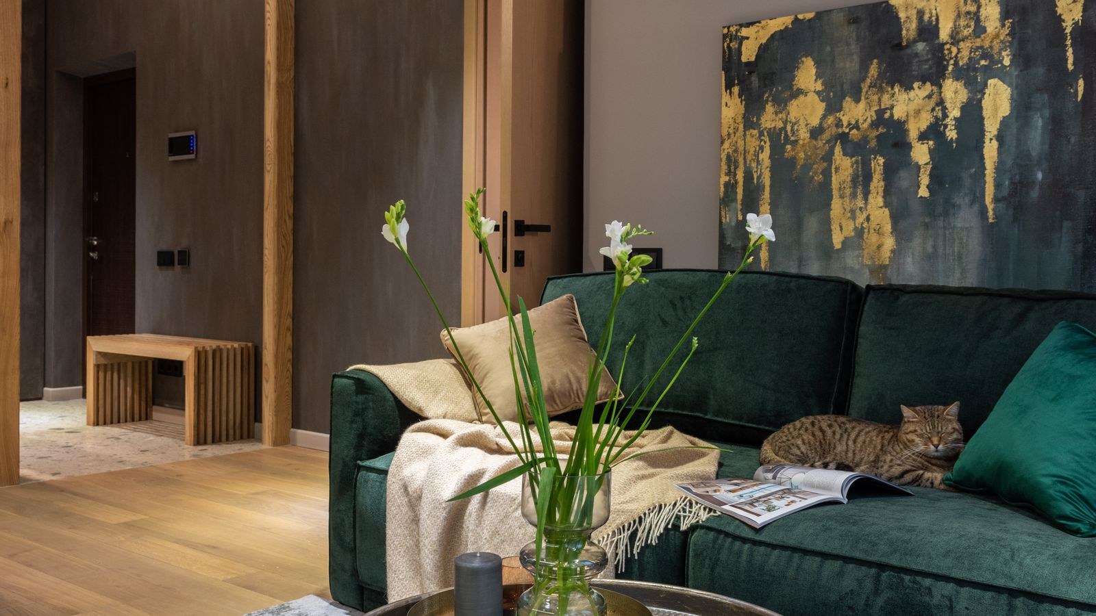
Fabric type affects how color behaves before the paint ever enters the picture. Velvet has a pile that shifts tone as you move around it, appearing darker and richer in one direction and lighter in another, so read the undertone from the flattest area you can find. Linen has visible slubs and usually a slightly grayed, matte finish that mutes whatever color it is dyed. Leather has depth and sheen that pick up reflected color from the room, meaning it looks different once the walls change. If you are still selecting the piece, our overviews of the best velvet sofas, best linen sofas, and best leather sofas cover how each material ages and reads in a room, and the broader roundup of the best sofas is a useful reference for shape and scale.
Choose a Relationship, Not a Match
Matching the wall to the sofa exactly almost never works. Paint and fabric take pigment differently, so a “matched” wall usually lands close enough to look like a failed attempt rather than a deliberate choice. Instead, pick one of four proven relationships.
- Tonal. Same undertone family, clearly different value. A mid-gray sofa with pale gray walls in the same temperature reads calm and layered.
- Neutral backdrop. A quiet wall in the sofa’s undertone temperature lets the furniture be the focus. This is the safest choice for a bold or heavily patterned sofa.
- Complementary accent. Pull a color from across the wheel and use it at low saturation. A muted terracotta wall behind a blue-gray sofa is a classic version.
- Contrast. A deep, saturated wall behind a light sofa, or the reverse. Dramatic, and it needs commitment to the rest of the palette.
The 60-30-10 Framework
Once you have a relationship, apportion it. Roughly 60 percent of the visible color in a room should be the dominant field — usually the walls. Thirty percent is the secondary, which is often the sofa and larger textiles. Ten percent is accent, delivered through pillows, art, and smaller objects. Deciding which role the sofa plays before you shop for paint prevents the common outcome where two strong colors fight for dominance and neither wins.
Step-by-Step: Testing Paint Against Your Sofa
- Identify the undertone. Use the white paper test in daylight, in at least two spots, and write down your conclusion in words.
- Shortlist three to five colors. Choose them within the relationship you picked, all sharing the sofa’s temperature unless you are deliberately going complementary. Resist shortlisting a dozen — it makes the decision harder, not better.
- Check the LRV. Light reflectance value, printed on most fan decks, runs from 0 to 100. Below about 25 is a deep color that will absorb light noticeably; above 70 is a light color that bounces it. Pick an LRV that suits how much natural light the room actually gets.
- Buy sample pots, not chips. A paint chip is too small and is surrounded by white card, which distorts your perception of it. Sample pots cost a few dollars each and save entire repaints.
- Paint large samples on poster board. Use white poster board, two coats, at least 12 by 12 inches with an unpainted border, and let it dry fully. Boards are movable, which matters more than anything else in this process.
- Move the boards around the sofa. Lean each one directly against the upholstery, then on the wall behind it, then on the wall opposite. Colors change depending on what they sit next to and what light hits them.
- Look at all four walls. Every wall receives different light throughout the day. A color that looks perfect on the sunny wall can turn muddy on the wall facing away from the window.
- Check in daylight and lamplight. Look at the boards at mid-morning, mid-afternoon, and at night with your lamps on. This is where most mistakes are caught, because the artificial light in the room at night shifts everything.
- Live with it for three days. First impressions of color are unreliable. Leave the boards up and notice which one stops bothering you rather than which one impresses you first.
- Choose the sheen last. Matte and eggshell hide wall imperfections and read softer next to fabric. Satin and semi-gloss reflect more and can make a color look lighter and cooler than the sample suggested.
Light Is Half of the Answer
Paint has no fixed color; it only has the color your lighting lets it show. North-facing rooms get cool, indirect light that pushes colors gray and can make warm beiges look muddy. South-facing rooms get warm, abundant light that intensifies everything. East-facing rooms are warm in the morning and cool by afternoon, and west-facing rooms do the reverse.
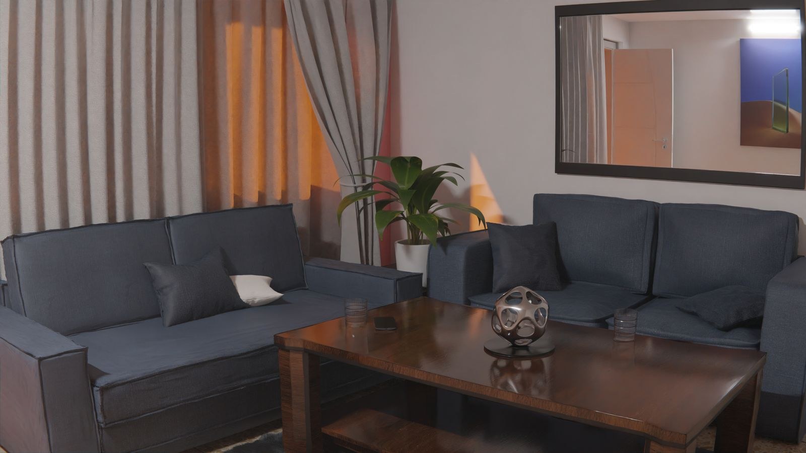
Artificial light matters just as much, because most people see their living room at night. A bulb at 2700K throws warm, yellowish light that flatters beiges and reds while dulling cool blues; a 4000K bulb renders colors closer to daylight but can feel clinical in a lounge. Color rendering index matters too — a low-CRI bulb makes upholstery and paint both look flat and slightly gray. Our guide to light color temperature explains how to read those numbers, and the living room lighting guide covers layering ambient, task, and accent light so the paint and sofa look consistent from afternoon through evening.
Common Mistakes
- Judging from a paint chip. Too small, and the white card around it fools your eye. Always paint a large sample.
- Painting samples directly on the existing wall. The old color bleeds through and contaminates your reading. Use poster board.
- Testing on only one wall. Light varies across the room; a color has to work on all four.
- Ignoring the flooring. A warm oak floor or a red-toned rug pushes the whole room warm and will fight a cool wall you chose in isolation.
- Trying to match exactly. Near-matches read as errors. Go clearly lighter, clearly darker, or clearly different.
- Deciding at night only. Or only in daylight. You need both, on separate days.
Frequently Asked Questions
Should the wall be lighter or darker than the sofa?
Either works, but the difference should be obvious. A gap of roughly 20 LRV points or more reads as intentional; anything closer reads as a failed match.
What paint color goes with a gray sofa?
It depends entirely on the gray’s undertone. A blue-leaning gray sits well with soft blues, greens, and cool whites. A warm greige works with creams, taupes, and muted terracotta. Identify the undertone first.
Can I use white walls with any sofa?
Only if you pick the right white. Whites have strong undertones too — a cool blue-white behind a warm beige sofa makes the sofa look yellowed. Match the white’s temperature to the upholstery.
How many sample colors should I test?
Three to five. More than that and you lose the ability to compare them meaningfully, and you start second-guessing choices you had already ruled out.
Does sofa fabric affect the paint choice?
Yes. Velvet shifts tone with the pile direction, linen mutes and grays its color, and leather reflects the room back at you. Read the undertone from a flat, evenly lit area of the fabric.
Final Thoughts
The whole process reduces to three moves. Find the sofa’s undertone with a white-paper comparison in real daylight. Decide on a relationship — tonal, neutral backdrop, complementary, or contrast — rather than attempting a match. Then test large painted boards against the sofa on every wall, in daylight and in lamplight, over several days before committing. Skipping the testing step is what causes repaints, and it is also the cheapest part of the job. Spend the twenty dollars on sample pots and the three days of looking, and the color you finally roll onto the walls will still look right a year from now.