 Owen Bradley
 Editors buy monitors on the wrong specification more often than any other group of computer users. The instinct is to chase resolution, because more pixels feels like more detail, and detail is what the work is about. But a 4K panel that shifts colour from centre to corner, or drifts half a stop brighter after an hour, will cost you far more time and more reprints than a modest 1440p screen that holds its calibration. Choosing a monitor for photo editing and video work is really about consistency: does the screen show the same colour today that it showed last week, and the same colour in the corner that it shows in the middle? This guide walks through the specifications that decide that, and the ones you can safely deprioritise.
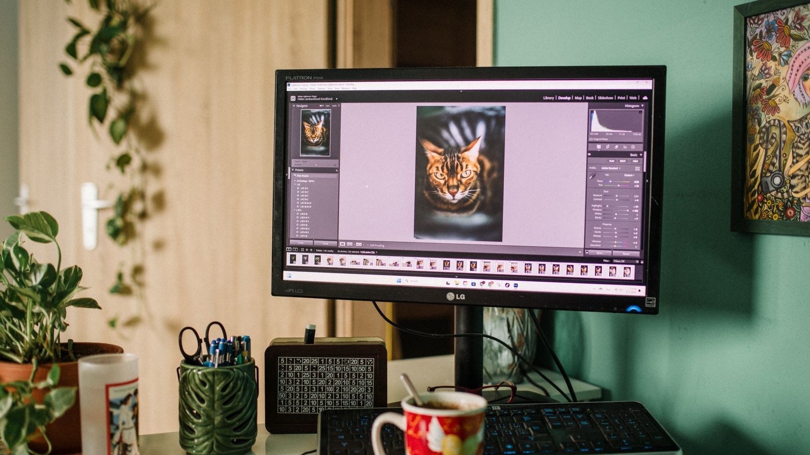
Accuracy Before Resolution
A monitor’s job in an editing suite is to be an honest reporting instrument. Every adjustment you make is a reaction to what the screen shows, so an error in the display propagates into every file you touch. If the panel runs slightly warm, you will cool every image to compensate, and every one of them will print or publish too cool.
Resolution, by contrast, affects how comfortably you work rather than whether the work is correct. More pixels give a bigger canvas at 100 percent zoom and smoother previews of fine texture, which is genuinely useful, but a sharpness deficit is visible and correctable while a colour error is invisible until someone else opens the file. Rank accuracy first, uniformity second, resolution third.
Colour Gamut: Match the Delivery Space
Choose the gamut your output actually lives in rather than the widest number available.
- Web and social delivery: full sRGB coverage is the requirement. Anything wider needs a working clamp or your exports will look oversaturated to everyone else.
- Video and HDR grading: 95 percent or better DCI-P3, since modern video is graded in that space.
- Print and fine art: 95 percent or better Adobe RGB, which maps far more cleanly onto CMYK inks, especially in cyans and greens.
- Mixed practice: a wide gamut panel with reliable hardware emulation modes so you can switch container per project.
Be careful with coverage versus volume. A claim of “130 percent sRGB” is a volume figure and can coexist with only 94 percent actual sRGB coverage. Look for the word coverage, and prefer measured figures from a review over the box. Panels built around this distinction dominate lists of the best monitors for photo editing precisely because they publish honest coverage numbers for each mode.
The Gamut Clamp Is Not Optional
On a wide gamut screen, any application that ignores colour profiles will push sRGB values onto P3 or Adobe RGB primaries and look badly oversaturated. Browsers vary, file managers usually fail, and most utilities never manage colour at all. A hardware sRGB mode that genuinely restricts the primaries fixes this. Confirm reviews measure the clamp as accurate, because some implementations just apply a saturation filter and are worse than useless.
Delta E and What Counts as Good
Delta E measures how far a displayed colour sits from the colour requested. Below 1 is imperceptible, 1 to 2 is invisible in normal work, 2 to 3 becomes noticeable on skin tones, and above 3 means visible casts. Aim for an average below 2 for general editing and below 1 for client-critical colour.
Read the maximum as well as the average. A panel averaging 0.9 with a peak error of 5 on deep reds will betray you on exactly the images where it matters. And check greyscale separately: if the neutrals carry a green or magenta tint, every white balance decision you make will be wrong in a consistent, hard-to-notice way.
Uniformity: The Specification Nobody Prints
Uniformity describes whether brightness and colour hold steady across the panel surface. Budget displays commonly vary 10 to 15 percent in luminance from centre to corner, and colour can drift by several Delta E units. In practice this means an image looks different depending on where you drag it, and a gradient that appears smooth on the left develops a shadow on the right.
Better editing monitors include hardware uniformity compensation, which measures the panel at the factory and corrects brightness zone by zone. It costs a little peak brightness and a lot of money, and it is the single clearest difference between a good general-purpose screen and a proper editing display. Timeline work makes uniformity especially visible because you are constantly comparing adjacent frames across a wide canvas, which is why it features so heavily in evaluations of the best monitors for video editing.
Hardware Calibration and Look-Up Tables
There are two ways to calibrate. Software calibration builds a profile on the computer and adjusts the signal before it reaches the screen, which discards levels from an 8-bit pipeline and can introduce banding. Hardware calibration writes the correction into the monitor’s own look-up table, leaving the signal untouched and applying the maths at 14-bit or 16-bit internal precision.
Hardware calibration is the better approach for three reasons: it survives switching computers, it does not consume tonal levels, and it applies to every input including a video reference feed. Look for explicit support for hardware calibration plus compatibility with a colorimeter you own or plan to buy.
Whichever method you use, calibrate on a schedule. Backlights drift measurably within a few months, and a factory calibration report describes one moment in the display’s life, not a permanent state. Monthly re-profiling is normal for professional work and quarterly is fine for enthusiasts.
Setting the Right Targets
- Luminance: around 100 to 120 cd/m² for print matching in a dim room, up to 160 for screen-only delivery in brighter conditions. Full brightness is always wrong for editing.
- White point: D65 for almost all work. D50 only if you match to a specific print viewing booth.
- Gamma: 2.2 for stills and general work, 2.4 for video graded for dim viewing environments.
- Black point: leave at native unless your workflow specifies otherwise.
Panel Technology and Contrast
IPS is the default choice for editing because colour and gamma hold steady across viewing angles. That matters even when you work alone: on a 32-inch screen your eyes view the corners off-axis, and a panel that shifts will show you different colour at the edges than in the middle. VA panels offer far deeper native contrast, which is attractive for dark video work, but their off-axis colour shift makes precise stills work frustrating. TN should be ruled out entirely.
OLED has become a serious option for video. Per-pixel emission gives perfect blacks, excellent shadow separation and no backlight bleed, which makes shadow grading far easier. The caution is static interface elements over long sessions and lower full-screen brightness in bright rooms. For stills retouching under normal lighting, a high-quality IPS panel remains the safer default, and the reasoning behind that is laid out well in comparisons of the best IPS monitors.
Resolution, Size and Sitting Distance
Pixel density drives comfort. Roughly 110 to 140 pixels per inch is the range where text is crisp and interface scaling behaves. A 27-inch 4K panel lands near 163 PPI, which is sharp but usually needs scaling; a 32-inch 4K panel lands near 138 PPI and often works at native size, which is why 32-inch 4K has become the default editing screen.
The real argument for 4K in editing is interface real estate. Video timelines, scopes, layer panels and reference windows all compete for space, and a higher resolution canvas lets you see the image large while keeping tools visible. If you decide the pixel count is worth the cost, compare current options among the best 4K monitors and check that the model you choose also clears the accuracy and uniformity bars above.
Ultrawide panels are excellent for timeline work and poor for stills, because judging an image while sitting close to a strongly curved surface distorts your perception of straight lines and edge brightness. Many video editors run an ultrawide for the interface and a smaller accurate panel as the reference display, which is a sound arrangement.
Bit Depth, HDR and Reference Grading
A true 10-bit panel, or 8-bit with frame rate control, prevents banding in skies, studio backdrops and long fades. For grading HDR deliverables you need more: real local dimming or per-pixel emission, sustained high brightness and accurate tracking of the PQ transfer curve. An entry HDR badge on an editing monitor means nothing at all for grading work.
Be realistic about whether you need HDR mastering capability. Most editors deliver standard dynamic range, and money spent on brightness would be better spent on uniformity compensation and hardware calibration. If HDR deliverables are part of your contract, budget for a proper reference-class display rather than expecting a general creative panel to do the job.
Connectivity and the Working Environment
Look for DisplayPort 1.4 or HDMI 2.1 to carry high resolution at 10-bit without compression artefacts. USB-C with power delivery is genuinely useful for laptop-based editors, collapsing power, video and peripherals into one cable. A built-in hub with fast USB ports saves reaching behind a tower for card readers and drives.
Do not neglect the room. A colour-accurate monitor in a room with a coloured wall behind it, a window on the left and warm ceiling lights will still mislead you, because your eye adapts to the surroundings. Neutral grey or white walls, controlled lighting around 5000K to 6500K, and a monitor hood to block stray light do more for consistency than an extra few percent of gamut coverage. Multi-purpose creative setups that juggle stills, video and streaming benefit from thinking about the whole environment, an angle covered well in guides to the best monitors for content creation.
Common Mistakes to Avoid
- Buying on resolution alone. Sharpness is comfort; accuracy is correctness.
- Running at full brightness. Editing at 350 nits guarantees your prints come out dark.
- Trusting a factory report indefinitely. Backlights drift within months.
- Using a wide gamut panel without a clamp. Unmanaged applications will lie to you daily.
- Ignoring the room. Ambient colour casts undo panel calibration.
- Skipping uniformity. A screen that changes across its own surface makes consistent grading impossible.
- Choosing VA or curved for stills. Off-axis shift and geometric distortion work against you.
Frequently Asked Questions
Do I really need 4K to edit photos?
No. A 27-inch 1440p panel with excellent accuracy and uniformity produces better results than an inaccurate 4K screen. Choose 4K for canvas space once accuracy is settled.
Is Adobe RGB or DCI-P3 better?
Adobe RGB for print because it covers ink cyans and greens. DCI-P3 for video and HDR because that is the grading space. Pick by delivery format.
How often should I calibrate?
Monthly for professional work, quarterly for enthusiast use, and always after moving the monitor or changing room lighting.
Is OLED safe for long editing sessions?
Modern panels include pixel-shift and refresh routines that make burn-in unlikely with normal use. Hide taskbars and vary your layout and it is a non-issue for most editors.
Does a monitor hood actually help?
Yes, noticeably, in any room with windows or overhead lights. It stops stray light lifting the apparent black level and shifting your perception of shadow detail.
Final Thoughts
Build your shortlist in a strict order. Confirm the panel covers the gamut your work is delivered in, with a real hardware clamp for the spaces you also need. Check measured Delta E averages and maximums, including greyscale. Look for uniformity compensation and hardware calibration support with an internal look-up table above 8 bits. Only then compare resolution, size and refresh rate. A screen that passes the first three tests will be trustworthy for years, and trustworthiness is what editing actually requires. The sharper panel is pleasant; the accurate panel is the one that stops you redoing work.