 Owen Bradley
Almost every wall that looks wrong looks wrong for the same reason: the art is too small. A single modest frame floating above a seven-foot sofa reads as an afterthought, no matter how good the image is. Scale, not taste, is what separates a wall that looks designed from one that looks decorated in a hurry. This wall art size guide gives you the proportions professionals use, from the two-thirds rule above furniture to the spacing that holds a gallery grid together, plus the hanging heights and frame proportions that make everything sit correctly. Follow it and you will buy the right size first time in 2026 instead of returning pieces that looked bigger online.
The Two-Thirds Rule Above Furniture
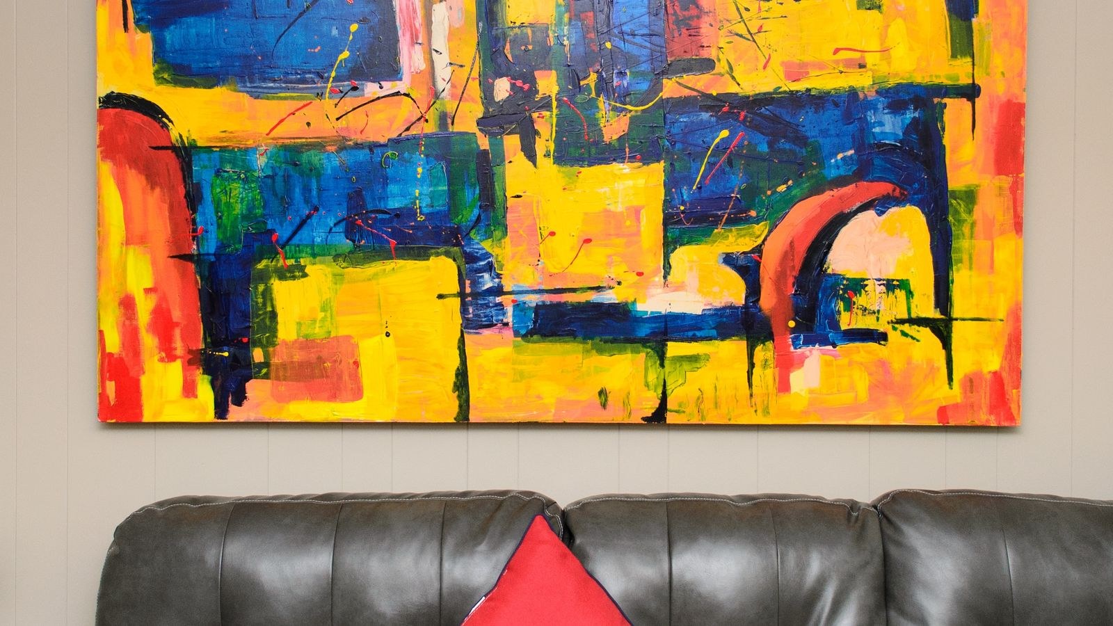
The foundational rule is simple: art hung above a piece of furniture should span roughly two-thirds to three-quarters of that furniture’s width. A standard three-seat sofa around 84 inches wide wants art totalling roughly 56 to 63 inches across. A 60-inch console wants 40 to 45 inches. A queen bed at 60 inches wide wants around 40 to 45 inches; a king at 76 inches wants 50 to 57.
“Totalling” is the key word. That width can be one large canvas, a pair of matching frames with a gap between them, or a grid of six small prints. What matters is the outer dimension of the whole arrangement, measured from the far left edge to the far right edge including the space in between. A trio of small prints spread to two-thirds of the sofa width looks intentional; the same three prints clustered in the middle looks lost.
The upper bound is the furniture itself. Art wider than the sofa beneath it looks unstable, as though it is overhanging. The exception is a deliberately oversized statement piece on a wall where the furniture is low and minimal, but that is a design decision rather than a default.
Vertical Space Above Furniture
Leave six to twelve inches of bare wall between the top of the furniture and the bottom of the frame, with eight inches a reliable default. Any less and the two objects visually merge into one lump. Any more and the art detaches, drifting up the wall with no relationship to the piece it is meant to anchor.
Sofas with tall backs or bulky cushions need the smaller end of that range, because the effective top of the furniture is higher than the frame suggests. Low-backed mid-century seating can take the larger gap. If you are choosing seating and art together, checking standard back heights first saves rework, and our comparison of the best sofas lists the widths and back heights that determine both numbers.
Hanging Height on an Open Wall
When there is no furniture beneath it, art should be centred at eye level. The museum standard puts the centre of the piece 57 to 60 inches from the floor, which corresponds to average standing eye height and is why gallery walls feel comfortable to view.
Adjust for how the room is used. In a dining room or a living room where everyone is seated, drop the centre by a few inches to around 54 to 57 inches. In a hallway where people are walking past, stay at 60. In a room with unusually high ceilings, resist the urge to hang high; the eye-level rule still applies, and the extra wall above simply becomes breathing room.
To find the hook position rather than the centre, use this arithmetic: take your target centre height, add half the height of the frame, then subtract the distance from the top of the frame down to the taut hanging wire. That gives you exactly where the nail goes, and it removes the guesswork that leads to a wall full of spare holes.
Common Print and Canvas Sizes and Where They Work
Knowing which standard sizes exist makes shopping faster. Small formats such as 8×10, 11×14 and 12×16 inches belong in gallery walls, on shelves, in narrow hallways or flanking a mirror. They are almost never right on their own above a sofa.
Medium formats of 16×20, 18×24 and 24×36 inches are the workhorses. A single 24×36 hung vertically suits a narrow wall or the space beside a doorway; a pair of them side by side covers a decent stretch above a console.
Large formats from 30×40 up to 40×60 inches and beyond are what most sofa walls actually need. This is the range people consistently underestimate. If your calculation says you need 60 inches of art above the sofa, one 40×60 canvas hung horizontally does the job in a single purchase.
Frames add to these numbers. A wide moulding with a generous mat can add six to ten inches to each dimension, so a 24×36 print can finish at 34×46. Always work with the outer frame dimension when you calculate coverage, not the print size quoted on the listing.
Pairs, Triptychs and Sets
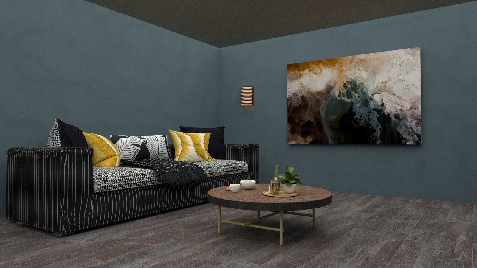
Two or three pieces read as one object when the spacing is right. For a pair, keep two to four inches between frames. For a triptych of equal panels, two inches is usually enough, since the set should look almost continuous. The tighter the spacing, the more the group behaves like a single large piece, which is exactly the effect you want above furniture.
Align pieces of the same size along both top and bottom edges. If the pieces differ in height, align the horizontal centre lines instead, and keep the vertical gaps consistent. Mixing orientations within a set works when the frames match, but two portraits flanking one landscape needs careful centring to avoid looking accidental.
A pair of vertical prints above a bed or a console is one of the most forgiving arrangements available, because you can tune the total width simply by adjusting the gap. Widen the gap to cover more of the wall, narrow it to tighten the composition.
Gallery Walls: Spacing and Structure
A gallery wall fails when the spacing wanders. Pick a single gap, usually two to three inches, and apply it everywhere. Three inches suits larger frames and bigger walls; two inches suits smaller pieces and keeps the group cohesive. The eye reads inconsistent gaps as sloppiness long before it notices the images.
Choose a structural approach and commit to it. A grid uses identical frames in even rows and columns, and it is the easiest to execute and the hardest to get wrong. A salon-style arrangement mixes sizes organically around a strong central anchor piece, with the largest works low and central and smaller pieces radiating outward. A linear arrangement runs frames along a shared centre line, which suits corridors and stairwells beautifully.
Whichever you choose, treat the entire group as one rectangle and apply the same two-thirds rule to its outer dimensions. Then cut paper templates for every frame, tape them to the wall with painter’s tape, and live with the layout for a day before drilling. Check it from the seat you will actually view it from, since a composition that balances when you are standing can lean when you are sitting.
Stairwells and Awkward Walls
On a staircase, hang along an imaginary line parallel to the slope, keeping the centre of each piece 57 to 60 inches above the tread directly beneath it. That produces a diagonal that follows the stairs rather than a horizontal row that fights them. For narrow walls between doors and windows, one tall vertical piece almost always beats several small ones, and it draws the eye upward, which helps low ceilings.
Matching Art to the Room’s Furniture and Light
Scale is not the only relationship worth getting right. Art sits within a room, so its weight should match the furniture around it. Heavy, dark, solid-framed pieces suit rooms with substantial upholstery and deep colours. Light, airy prints with wide white mats suit rooms with slim-legged furniture and pale walls. A delicate line drawing above a chunky sectional will always look underpowered, regardless of its dimensions.
Bedrooms follow the same arithmetic as living rooms but usually want calmer subject matter and a single anchor piece above the headboard rather than a busy grid. If you are building the room from scratch, our overview of the best furniture for bedroom covers the headboard and dresser widths that set your art dimensions, and for seating areas the best living room chairs comparison shows how chair scale affects what fits on the wall behind.
Lighting decides whether any of this is visible. Art hung on a wall with no direct light flattens out and loses its colour after dusk. A floor lamp angled toward the wall, a picture light above the frame, or ceiling spots aimed at roughly thirty degrees all bring a piece back to life. Our guide to the best lamps for living rooms covers fixtures with the right output and beam spread, and the living room lighting guide explains how to layer ambient, task and accent light so the art is lit without glare.
Quick Reference Numbers
- Above furniture: art spans two-thirds to three-quarters of the furniture width, never more than the furniture itself.
- Gap above furniture: six to twelve inches, with eight as the safe default.
- Open-wall centre height: 57 to 60 inches from the floor, dropping to 54 in seated rooms.
- Gap between frames: two to three inches, kept identical throughout an arrangement.
- Above a queen bed: roughly 40 to 45 inches of total art width.
- Above a standard sofa: roughly 56 to 63 inches of total art width.
Common Mistakes That Make Art Look Wrong
The biggest, again, is undersizing. Framed art always appears larger in a photograph than on a real wall, because photos crop out the surrounding space. When a calculation puts you between two available sizes, take the larger one.
Hanging too high is the second most common problem. Art creeping up toward the ceiling breaks the connection with the furniture and leaves an awkward band of empty wall in between. The third is inconsistent spacing in multi-piece arrangements, which undermines even excellent individual pieces.
Two subtler errors are worth naming. Ignoring frame width when calculating coverage leaves you short, because the mat and moulding count toward the visual footprint. And centring art on the wall rather than on the furniture beneath it produces a piece that looks off-axis from every seat in the room; when the two do not align, always centre on the furniture.
Frequently Asked Questions
How wide should art be above a sofa?
About two-thirds of the sofa’s width, so roughly 56 to 63 inches for a standard 84-inch sofa. Measure the total width of the arrangement including the gaps between frames.
How high should I hang a picture?
Centre it 57 to 60 inches from the floor on an open wall, or six to twelve inches above the top of the furniture when there is something beneath it.
What gap should I leave between frames?
Two to three inches, applied consistently. Tighter spacing makes a set read as one piece; wider spacing quickly starts to look scattered.
Is one large piece better than several small ones?
Usually, yes, especially above large furniture. One generous piece is easier to hang, easier to balance, and almost always looks more considered than a cluster of small frames.
Should art be centred on the wall or the furniture?
On the furniture. The relationship between the art and the piece below it is what the eye reads, so centring on the sofa or bed matters more than centring on the wall.
Final Thoughts
Getting wall art right is arithmetic before it is taste. Measure the furniture, take two-thirds of that width, add up the frames and gaps until you reach the number, leave eight inches of wall above the furniture, and centre everything at eye level. Keep the spacing between frames identical, work with outer frame dimensions rather than print sizes, and make paper templates before you touch a drill. Do that and even inexpensive prints look deliberate, while the most beautiful piece in the world hung at the wrong scale will always look like it wandered onto the wall by accident.